Extend, Flatten, Jump. Sounds like diving instructions or some other sports coaching. But that is not what I am writing about. Instead it is a way of thinking about graphs, and how ‘Extend, Flatten, Jump’ can affect how we make decisions about quality. Much of quality work uses time series. A time series is a list of numbers where each number is labeled with a unique time value, whether in seconds, minutes, days or years.
In medical quality, the time series used are often counts of undesirable events in a given time period. Examples are falls, outbreaks, device malfunctions, or relapses. Time series can also show averages of clinical measurements such as cell counts, chemical analytes or tumor size across several people. Although the time series might represent several events, it is still one number with one time point (1). Time series are typically shown as line graphs, with the time on the x axis and the result on the y axis. Adding more time points, ‘extend’, can make the recent events look less severe. Increasing the range of the y-axis to ‘flatten’ the graph can make things look less noisy. And a sudden jump in values near the end can affect perception of the whole series, even when not much has changed. And perception can affect actions. Let’s say we have 20 weeks of event counts, (pick your adverse event) starting with the first Monday of this year. The order of the dates gives a position to each event where the count of events during the week of 2014-01-06 has position 1, the 2014-01-13 has position 2, through position 20.
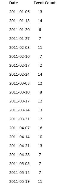
If we are interested in the last 10 weeks, we can graph as follows. I will use numbers on the x-axis in order to avoid clutter. I use the range for count as 0 to 16, with a tick mark every 4 units.
Extend
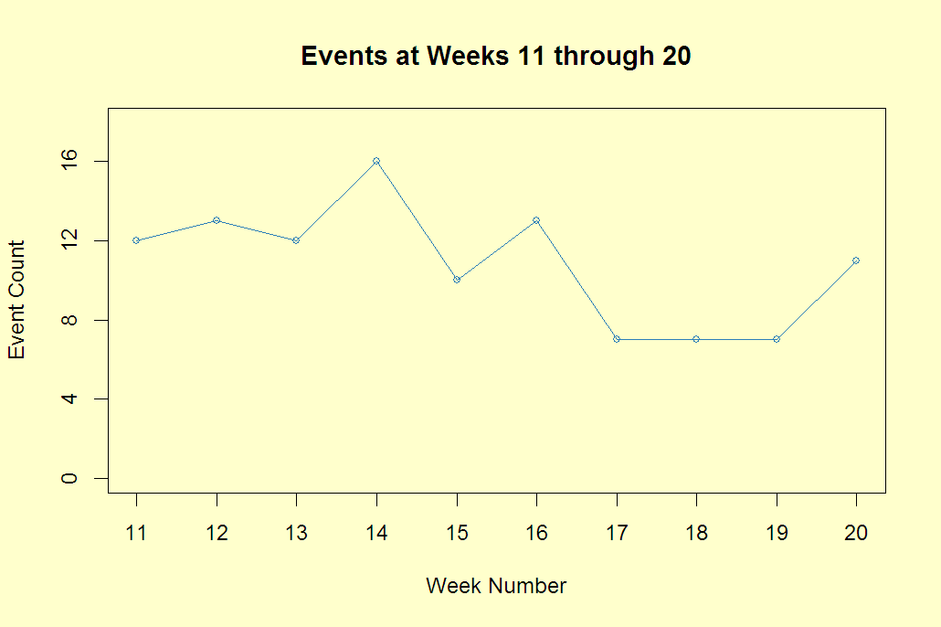
Extending back to position 1, and compressing the data in a graph of the same width looks as follows: 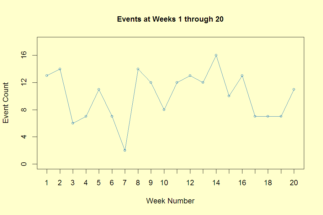 What does adding prior data give to your perception of how well this clinic is doing in managing the adverse event?
Flatten
The following graph shows the last 10 points but note that the y-axis is extended by 50%. This flattens out the results.  The maximum of the time series, 16, at week 14 looks less severe but it is the same data.
Jump
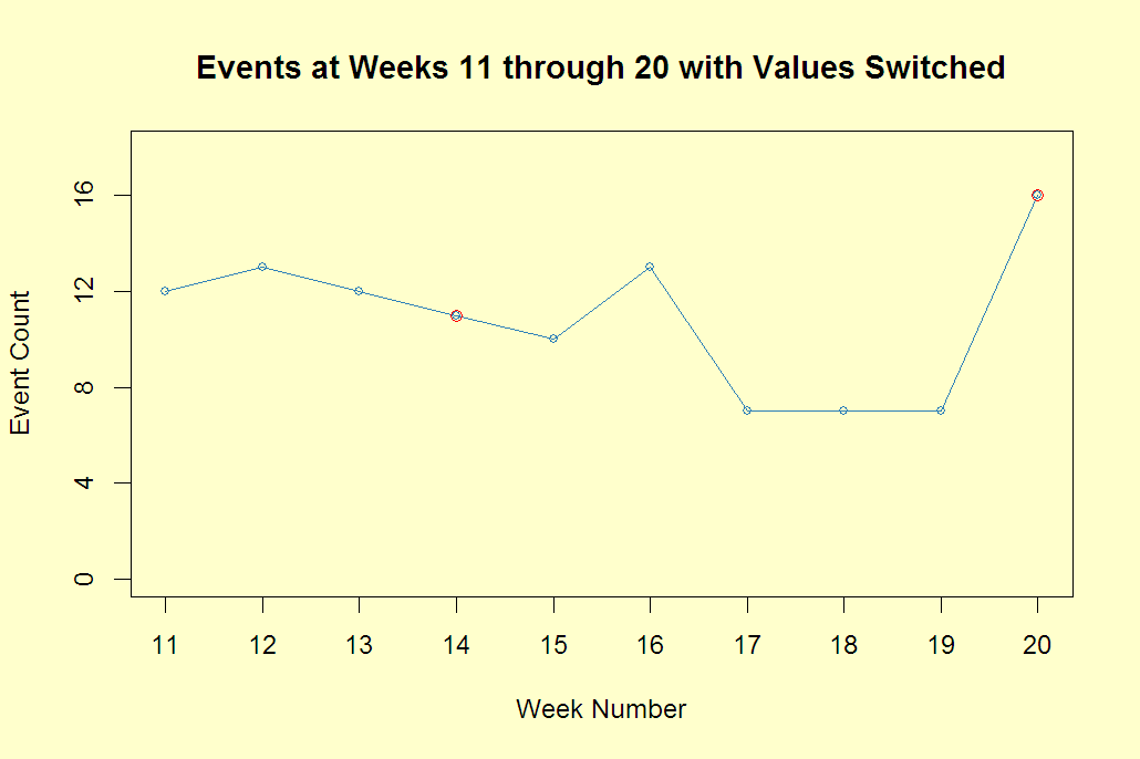
This is a situation that can make managers jump. We were doing so well, and then what happened last week? The truth is that these are 20 simulated numbers from a Poisson distribution (2) with a mean of 10 and a sample mean, the average of the 20 numbers, of 10.1. They are all independent of each other. While often in time series this isn’t the case, it is a good place to start.
I have taken inspiration for this post from an article in the Spring 2014 issue of CHANCE, a statistics magazine, called “Your Textbook Can’t Help You Here.” (Michael Lopez, Adrian Esparza, Michael Lavine, Jenna Marquard. http://chance.amstat.org/2014/04/textbook) Professor Jenna Marquard of the University of Massachusetts School of Engineering researches decision-making in health information technology.
Georgette Asherman July 16, 2014
(1) Longitudinal studies track a group of subjects at several time points. In longitudinal studies the major interest is how different subjects change at each measurement. In time series the major interest is the pattern of the series over at least 8 time points.
(2) It is common to use the Poisson distribution to fit count data. It provides integer values to describe a count of events in a give unit of time or space. The mean and variance are equal so a higher average count will have more spread.